The Map in the Arena, Redux
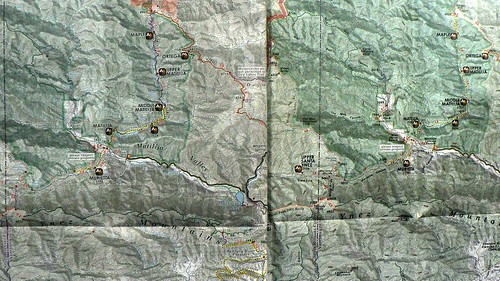
Back in the Spring of 2012, I posted a review of Bryan Conant’s 2008 (first edition) Matilija & Dick Smith Wilderness map. I was about four years late in reviewing that great map, but I’m happy to report a new edition has just landed in map cabinets near you, and I’ve got your review right here … right now!
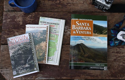
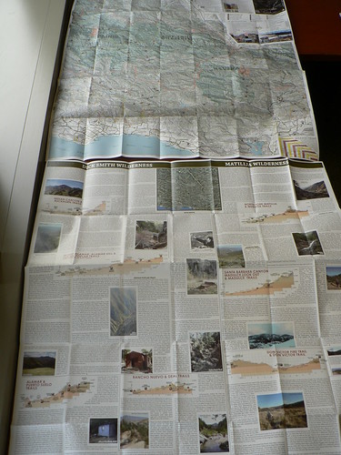
The Holy Trinity (and a book). Image courtesy and © Li’l G.
NB: I suggest first reading my review of the 2008 to understand the basics of the product, which I’m not repeating herein. Treat this is a sequel to that initial review.
Now. Remember when the Sears Christmas “Wish List” catalog would show up around Thanksgiving time, and you’d just absorb it for hours, daydreaming well past the holidays? The new map feels a lot like that if you’re a LPNFanatic.™
What’s New
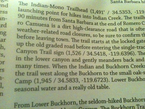
A lot. The 2012 map has a full verso, jam-packed with historical photos (including the Alamar Tin Shack), anecdotes, and summaries detailing major routes and destinations. It leverages numerous resources for a veritable feast of Los Padres intel, laid out in a big 28″ x 31.5″ poster. The language is concise, peppered with enough of Conant’s personality to be welcoming, but not so informal as to come off sloppy. That’s a fine line, and he achieves it here. As an admittedly snarky wordsmith, I give him full marks.
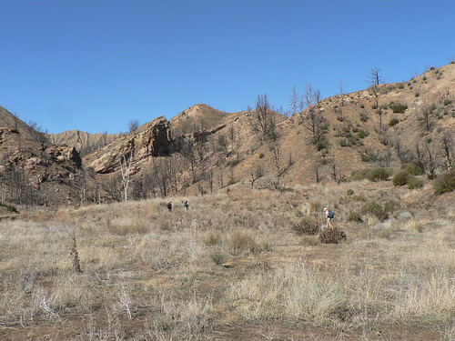
Ruggo, the Billy Monster, and Blue along Deal Canyon, Winter 2010.
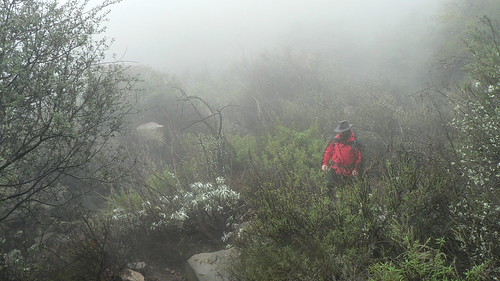
The RSO along the East (East) Camino Cielo, Fall 2012.
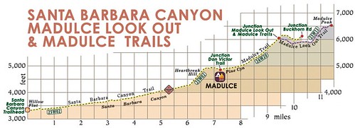
One of the greatest features of the verso are the new trail profiles. Yes, I said it … anybody who knows my rather finicky carto-preferences know I have a poorly-veiled disdain for trail profiles, those ridiculously misrepresentative graphics that make things looks far steeper than they are, sucking up space and yielding little useful intel.
The one exception I usually grant for profiles are the later-edition Dibblee maps, where the profile is a structural cross-section/elevation/profile and isn’t rendered at some ridiculous scale where the x and y are grossly disproportionate.
Well guess what? Conant’s profiles are just as practical, with multiple tracks trending upward or downward as elevation profiles warrant. They’re set in a linear A-to-B fashion, naturally, to illustrate the distance along the x and elevation along the y. Whilst it’s not a 1:1 ratio (admittedly, that would be impractical) it’s not at all ridiculous. I love it.
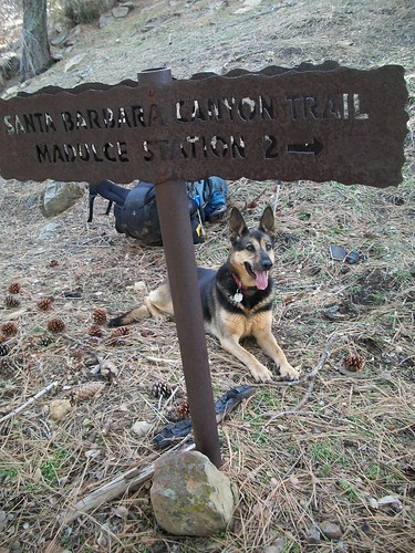
The uber-hund at the Madulce/Madulce Lookout Junction, Winter 2011.
On the front, there is also a great mileage grid for the most-likely-to-be-traveled routes. A very nice addition.
Also new to this new edition are points of interest and historic sites (what we in the dungeons like to call “diamonds in the rough“), rendered in small caps and violet (comment dit-on “aubergine,” mon cherie?). These include such gems as the Grapevine camps, the original Ortega trail camp, and the like. A great service to the historically-inclined wanderers of our wood.
The 2013 map also provides the trail designations for most of the routes, in a clever little semi-transparent shield-like icon. Some are missing, but overall I think this is great (of course, trail designations are something over which much time is spent obsessing here in the dungeons … refer to Series 18 West, Series 19 West, Series 20 West, and Series 21 West for the conversation thus far. We’ll hit the range this map encompasses in due time, dear reader).
Also now included in the symbol set are the NRT shields (for the Santa Cruz and Gene Marshall/Piedra Blanca NRTs) and the Condor Trail icon for the routes along that proposed route. Brilliant.
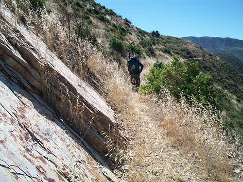
The RSO along 40-Mile Wall, Summer 2011.
This map includes QR codes for smartphones, which I think is another nice touch.
Bryan has also updated his website with lots of useful information, including some solid tips for navigating the rougher sections of our backcountry.
What’s Changed
The few mileage errors noted in the four years since the first edition have been revised, and very minor placements of some labels better represent where toponomy (typically where it pertains to water courses) of certain parts of the Forest applies.
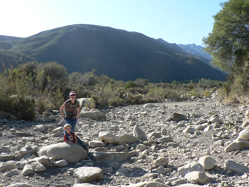
HRH and Little Man along Matilija Creek, Fall 2009.
Along with the nits I made in my first review, a few minor additions/exclusions are notable (e.g., the inclusion of Kellogg trail camp, the exclusion of the contested Middle Fork Matilija route, etc.). Where routes have changed, gates have opened, and camps closed, it’s shown.
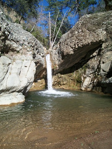
A Nice Little Lunch Spot, Winter 2011.
One of the nicest changes is the contrast of colors is less jarring, taking on a subtler tone (Harrison’s 2012 map that same adjustment, which I applauded then, as well). It’s nothing dramatic; just cleaner lines on the block labels and a greater transparency on the wilderness fills. But it makes for a marked improvement in readability.
What’s the Same
The symbol set — with the additions noted above — remains the same. Main fonts are still Century Gothic and Century Schoolbook.
The map covers the same area, so — like the 2008 edition — Mr. Conant could sell a map of just the Santa Barbara backcountry section and still have a massively useful product.
The Nitty
While the base map still utilizes the typefaces from the 2008 edition, the verso utilizes those two as well as Tiepolo (for the axes’ labels) and Chaparral for content (the irony there is lost on nobody, Dr. Map!). Both are great fonts, Chaparral especially in its use here. It gives the verso a really fresh look, but not that superficial “Web 2.0” look. One drawback to this facelift with the fonts is that it makes the map side look a bit dated.
The folds on my map seem a bit half-hearted. I like sharp creases in my cuffs, and sharp folds on my maps. This is probably just a printer thing, and we OCD folks can make that sort of “repair” in the field.
Additionally, on the beautiful new verso, there are a few grammatical tweaks I’d make, but of such minor consequence I won’t even bother detailing them overly. Most are style preferences or Chicago v AP-style issues.
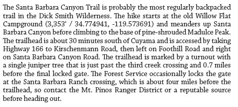
In the “super-nit” department, some of the elevations are missing their “feet” (apostrophe) on the verso.
Elsewhere, while most elevation coordinates (in decimal degrees) are provided to four places, on the Santa Barbara Canyon write-up it goes all polydactyl on us (six digits) and the smart quote on the elevation is inverted. (I would posit this was simply a paste oversight; layout programs such as InDesign, Quark, Pagemaker, and the like are known to do this when importing raw text.)
My One Big Complaint
It’s craigRcarey.net, thank you kindly. (Ouch!) 😉
The Gritty
The map’s price has increased from US$8.95 to $10.95, but it’s more than worth the extra two bucks for that back panel alone.
The 2013 Matilija & Dick Smith Wilderness map is available at Bryan’s website, as part of the larger Beard Bundle here on this very site, amazon, REI, Real Cheap Sports in Ventura, and sundry other places. Go get some!
Verdict
The best LPNF map just got better; I can’t imagine the blood, sweat, and beers that must have gone into assembling this. Highest rating.
The term “LPNFanatic” is ™ Nico.



Leave a Reply